Web Smarts - Business Savvy
We’ve been building websites since 1998
We are trusted advisors to Over 50 Active Clients within several industries including associations and nonprofits, healthcare, financial services, retail, B2B and more.

We Are
Trusted
Partners
After we deliver a quality website on time and within your budget, we will be there for when it really counts. We will be proactive, consultative and strategic after we launch your website.

We Are
Integration
Experts
We’ve integrated with virtually every AMS system on the market as well as most LMS, publication, advocacy and career center applications. Our company was founded on custom development.

We build websites that are easy to edit, manage and design using the best content management system on the market, Sitefinity CMS.
We Provide A Full Spectrum Of Services


Our Clients Are Our Partners....
John Wurm

The team at Vanguard helped us think about our digital presence from the perspective and needs of our users, while holding true to the values our organization espouses.
Connect With Us
Improve Your Webcopy
Sitefinity 13


The
Vanguard View
Technology articles about one topic from the perspective of Leadership, Marketing and IT professionals .
The Do's and Don'ts of Side Navigation
Imagine, for a second, yourself visiting a website. You dove deep into the website, and are reading up on detailed, important content. After you get to the end of this content, you look up to go somewhere else. Maybe you look at the header of the webpage. Maybe you quickly scan the content and see some words underlined in blue. Or maybe, you see a small box to the right with links. When you click one of them, where do you go? Does it download a document? Show you were you are? Take you to another site?
Our trusty side navigation has been around forever. So today, let’s take a quick refresher and go over the do's and don'ts of side navigation.
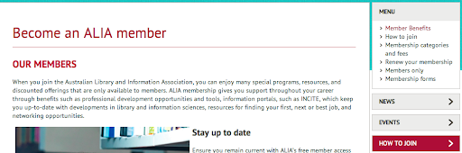
Do: Indicate to your users where they are.
It's incredibly important to help your users orient themselves to where they are while navigating through your website. Whether this means bolding an item in the navigation or differentiating it from the links around it - you need to indicate to your users, "Hey! This is where you are."
Don't: Put directly downloadable documents into the side navigation.
The side navigation is for just that - navigation. Putting documents and, as we'll talk about next, external links into this section can throw the user off once they click on the respective item. When a user sees a link with a navigation section of the page, they expect it to take them to a page (as opposed to a link within the page that may say something like "download the document here"). If that user clicks on the link and it starts downloading a document instead of going to a page, the disconnect between the action that actually occurs and what was expected creates a negative experience.
Instead, lead the user to a page where they can download the document, even if it is a short page. This won't mess with the users’ preconceived understanding of how to travel through your site.
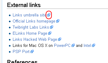
Don't: Put external links into the side navigation, but if you do…
…you must be communicative about it! Here is where we get to the crux of the issue when it comes to the implementation of side navigation. The side navigation is a tool to assist your users in traveling through the website. It is like a mini map outlining the section of the website they are browsing. If users can't understand what they're about to click on, or where it will take them, we have an issue.
So, if you have external links in your side navigation, add this simple icon letting your user know, "Hey you'll be leaving the website!"
In summary, consider the how the side navigation can say the following:
"Here is where you are, here is where you can go, and this is what you can expect once you get there."
If you have any questions about side navigation best practices, reach out to your friendly Vanguard client manager.
Vanguard Tips & Tricks
We provide helpful hints you never knew you needed for our clients. Check out "Vanguard Tips & Tricks" to learn quick and simple hacks to make managing your website easier than ever.
The Do's and Don'ts of Side Navigation
Imagine, for a second, yourself visiting a website. You dove deep into the website, and are reading up on detailed, important content. After you get to the end of this content, you look up to go somewhere else. Maybe you look at the header of the webpage. Maybe you quickly scan the content and see some words underlined in blue. Or maybe, you see a small box to the right with links. When you click one of them, where do you go? Does it download a document? Show you were you are? Take you to another site?
Our trusty side navigation has been around forever. So today, let’s take a quick refresher and go over the do's and don'ts of side navigation.
Do: Indicate to your users where they are.
It's incredibly important to help your users orient themselves to where they are while navigating through your website. Whether this means bolding an item in the navigation or differentiating it from the links around it - you need to indicate to your users, "Hey! This is where you are."
Don't: Put directly downloadable documents into the side navigation.
The side navigation is for just that - navigation. Putting documents and, as we'll talk about next, external links into this section can throw the user off once they click on the respective item. When a user sees a link with a navigation section of the page, they expect it to take them to a page (as opposed to a link within the page that may say something like "download the document here"). If that user clicks on the link and it starts downloading a document instead of going to a page, the disconnect between the action that actually occurs and what was expected creates a negative experience.
Instead, lead the user to a page where they can download the document, even if it is a short page. This won't mess with the users’ preconceived understanding of how to travel through your site.
Don't: Put external links into the side navigation, but if you do…
…you must be communicative about it! Here is where we get to the crux of the issue when it comes to the implementation of side navigation. The side navigation is a tool to assist your users in traveling through the website. It is like a mini map outlining the section of the website they are browsing. If users can't understand what they're about to click on, or where it will take them, we have an issue.
So, if you have external links in your side navigation, add this simple icon letting your user know, "Hey you'll be leaving the website!"
In summary, consider the how the side navigation can say the following:
"Here is where you are, here is where you can go, and this is what you can expect once you get there."
If you have any questions about side navigation best practices, reach out to your friendly Vanguard client manager.
Case Studies
Vanguard conducts thorough preliminary investigative work to ensure your website is built to cater specifically to your target audience and meet your organization’s goals. Check out some of the case studies on some of our most recent client success stories.


What Can Vanguard Do For You?
As your organization grows and evolves, your website should as well. Whether you are looking to generate more traffic, implement custom functionality, mobile compatibility, integrate your systems, or give your site a complete redesign, Vanguard Technology is your go-to web partner. Reach out to us with your current concerns with your website, and our experts will happily provide a solution.
Leave a commentOrder by
Newest on top Oldest on top