Web Smarts - Business Savvy
We’ve been building websites since 1998
We are trusted advisors to Over 50 Active Clients within several industries including associations and nonprofits, healthcare, financial services, retail, B2B and more.

We Are
Trusted
Partners
After we deliver a quality website on time and within your budget, we will be there for when it really counts. We will be proactive, consultative and strategic after we launch your website.

We Are
Integration
Experts
We’ve integrated with virtually every AMS system on the market as well as most LMS, publication, advocacy and career center applications. Our company was founded on custom development.

We build websites that are easy to edit, manage and design using the best content management system on the market, Sitefinity CMS.
We Provide A Full Spectrum Of Services


Our Clients Are Our Partners....
John Wurm

The team at Vanguard helped us think about our digital presence from the perspective and needs of our users, while holding true to the values our organization espouses.
Connect With Us
Improve Your Webcopy
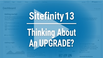
Sitefinity 13

The
Vanguard View
Technology articles about one topic from the perspective of Leadership, Marketing and IT professionals .
Don't Be Afraid of Narrow Content
Oftentimes we hear from clients that there's too much white space, or that they want to fill every last spot with content. It oftentimes comes from a place of good intentions - maybe that they need their users to know about what's happening in their giant organization, and stay up-to-date with what's important. But oftentimes the context and the situation are more nuanced than that, and that a better design solution doesn't mean that we need more for our users to interact with.
In order to set the stage and address why we don't need to fear narrow content, how we can have better responses to the concerns of user engagement, and why we don't need to constantly bombard our users with every aspect of who we are at every step of the way, we need to talk about two words: depth and scope.
The Depth Sets the Scope
Depth on a website simply means how far down we're digging into the content, and scope means how much we're shown. Ideally, the deeper we get, the narrower our scope gets. At the highest level, on the homepage, we want the widest scope.
As your users interact with your website, they are like looking for something, or maybe waiting to be shown something. The users that are here as "visitors" need to be shown what you have to offer. These users will likely not go deep into the website itself, but instead skim upper level pages. The users that are here as "explorers" or maybe even as "treasure hunters," are more likely going to dive into what you have to offer. Much like a trip to the beach, your visitors want to enjoy and be delighted with they see on the surface. Your treasure hunters don't care as much for pomp and circumstance and would much rather dive in and discover something.
The level of depth on the website helps frame how utilitarian and communicative we need to keep our design. This answers one of our concerns, "why don't we need to bombard our users with who we are every step of the way?" Your users who dive deep don't need to be inundated with extra content than what they're looking for because they will likely already know why they are here.
Your beach "visitors," on the other hand, need to be shown who you are, and be enticed to dive deeper.
The idea of depth and scope also addresses the second concern, "How can we better engage with our users?" Again, the depth sets the scope. Your visitors, at the highest level of your web architecture, likely need to be shown the breadth of your identity and content. The homepage is the place for delightful interactions, engaging imagery, and short-but-sweet content. The deeper and deeper you go, and the narrower and narrower your scope gets, the less these need to happen. At the bottom-most level, or as we call it at Vanguard, the L3 page, you're likely to be met with a simple page that houses specific content.
It's here that we can finally talk about why we don't need to be afraid of narrow content.
The Pearl at the End of the Dive
It's at this point in your users’ journey, that they've reached what they've been looking for. There's no need for anything more than a quick way back to the previous level of content. Filling the entire space of an L3 page as an attempt to reduce white space or keep users engaged often does more harm than good and takes away from the small but valuable content that they need. It's at this point that they need a simple, easy to read page. Don't have more than 14 words in a line at this point (usually any more than this begins to decrease readability). Keep any CTAs (calls to action) minimal and deliberate. And, ask yourself, "Do I really need this on this page?" and "Will this be distracting for my user who needs to know this information?"
Don't fear narrow content: The depth sets the scope, and we don't need to bend over backwards to try to make content bigger than it needs to be.Vanguard Tips & Tricks
We provide helpful hints you never knew you needed for our clients. Check out "Vanguard Tips & Tricks" to learn quick and simple hacks to make managing your website easier than ever.
Don't Be Afraid of Narrow Content
Oftentimes we hear from clients that there's too much white space, or that they want to fill every last spot with content. It oftentimes comes from a place of good intentions - maybe that they need their users to know about what's happening in their giant organization, and stay up-to-date with what's important. But oftentimes the context and the situation are more nuanced than that, and that a better design solution doesn't mean that we need more for our users to interact with.
In order to set the stage and address why we don't need to fear narrow content, how we can have better responses to the concerns of user engagement, and why we don't need to constantly bombard our users with every aspect of who we are at every step of the way, we need to talk about two words: depth and scope.
The Depth Sets the Scope
Depth on a website simply means how far down we're digging into the content, and scope means how much we're shown. Ideally, the deeper we get, the narrower our scope gets. At the highest level, on the homepage, we want the widest scope.
As your users interact with your website, they are like looking for something, or maybe waiting to be shown something. The users that are here as "visitors" need to be shown what you have to offer. These users will likely not go deep into the website itself, but instead skim upper level pages. The users that are here as "explorers" or maybe even as "treasure hunters," are more likely going to dive into what you have to offer. Much like a trip to the beach, your visitors want to enjoy and be delighted with they see on the surface. Your treasure hunters don't care as much for pomp and circumstance and would much rather dive in and discover something.
The level of depth on the website helps frame how utilitarian and communicative we need to keep our design. This answers one of our concerns, "why don't we need to bombard our users with who we are every step of the way?" Your users who dive deep don't need to be inundated with extra content than what they're looking for because they will likely already know why they are here.
Your beach "visitors," on the other hand, need to be shown who you are, and be enticed to dive deeper.
The idea of depth and scope also addresses the second concern, "How can we better engage with our users?" Again, the depth sets the scope. Your visitors, at the highest level of your web architecture, likely need to be shown the breadth of your identity and content. The homepage is the place for delightful interactions, engaging imagery, and short-but-sweet content. The deeper and deeper you go, and the narrower and narrower your scope gets, the less these need to happen. At the bottom-most level, or as we call it at Vanguard, the L3 page, you're likely to be met with a simple page that houses specific content.
It's here that we can finally talk about why we don't need to be afraid of narrow content.
The Pearl at the End of the Dive
It's at this point in your users’ journey, that they've reached what they've been looking for. There's no need for anything more than a quick way back to the previous level of content. Filling the entire space of an L3 page as an attempt to reduce white space or keep users engaged often does more harm than good and takes away from the small but valuable content that they need. It's at this point that they need a simple, easy to read page. Don't have more than 14 words in a line at this point (usually any more than this begins to decrease readability). Keep any CTAs (calls to action) minimal and deliberate. And, ask yourself, "Do I really need this on this page?" and "Will this be distracting for my user who needs to know this information?"
Don't fear narrow content: The depth sets the scope, and we don't need to bend over backwards to try to make content bigger than it needs to be.Case Studies
Vanguard conducts thorough preliminary investigative work to ensure your website is built to cater specifically to your target audience and meet your organization’s goals. Check out some of the case studies on some of our most recent client success stories.
What Can Vanguard Do For You?
As your organization grows and evolves, your website should as well. Whether you are looking to generate more traffic, implement custom functionality, mobile compatibility, integrate your systems, or give your site a complete redesign, Vanguard Technology is your go-to web partner. Reach out to us with your current concerns with your website, and our experts will happily provide a solution.
Leave a commentOrder by
Newest on top Oldest on top