Web Smarts - Business Savvy
We’ve been building websites since 1998
We are trusted advisors to Over 50 Active Clients within several industries including associations and nonprofits, healthcare, financial services, retail, B2B and more.

We Are
Trusted
Partners
After we deliver a quality website on time and within your budget, we will be there for when it really counts. We will be proactive, consultative and strategic after we launch your website.

We Are
Integration
Experts
We’ve integrated with virtually every AMS system on the market as well as most LMS, publication, advocacy and career center applications. Our company was founded on custom development.

We build websites that are easy to edit, manage and design using the best content management system on the market, Sitefinity CMS.
We Provide A Full Spectrum Of Services


Our Clients Are Our Partners....
John Wurm

The team at Vanguard helped us think about our digital presence from the perspective and needs of our users, while holding true to the values our organization espouses.
Connect With Us
Improve Your Webcopy
Sitefinity 13

The
Vanguard View
Technology articles about one topic from the perspective of Leadership, Marketing and IT professionals .
A Call to Explore Styling
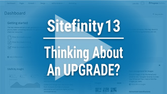
Consider the following websites. There are two newspapers and two blogs. What did you expect to see? Are there any elements that are used in a way that is different than what you expected? Were these effective and pleasing? Or jarring and uncomfortable?
Images courtesy of:https://www.nytimes.com/,
https://www.washingtonpost.com/,https://medium.com/, https://design.google/
What works is often what we've grown used to:
- Clicking on the logo in the header brings us back to the homepage.
- Navigation links are also in the header, with utility navigation links above the header.
- Maybe we're expecting some sort of hero image once we land on the homepage of a website.
- Wait.
- Is that a serif font? What the heck is THAT doing here?
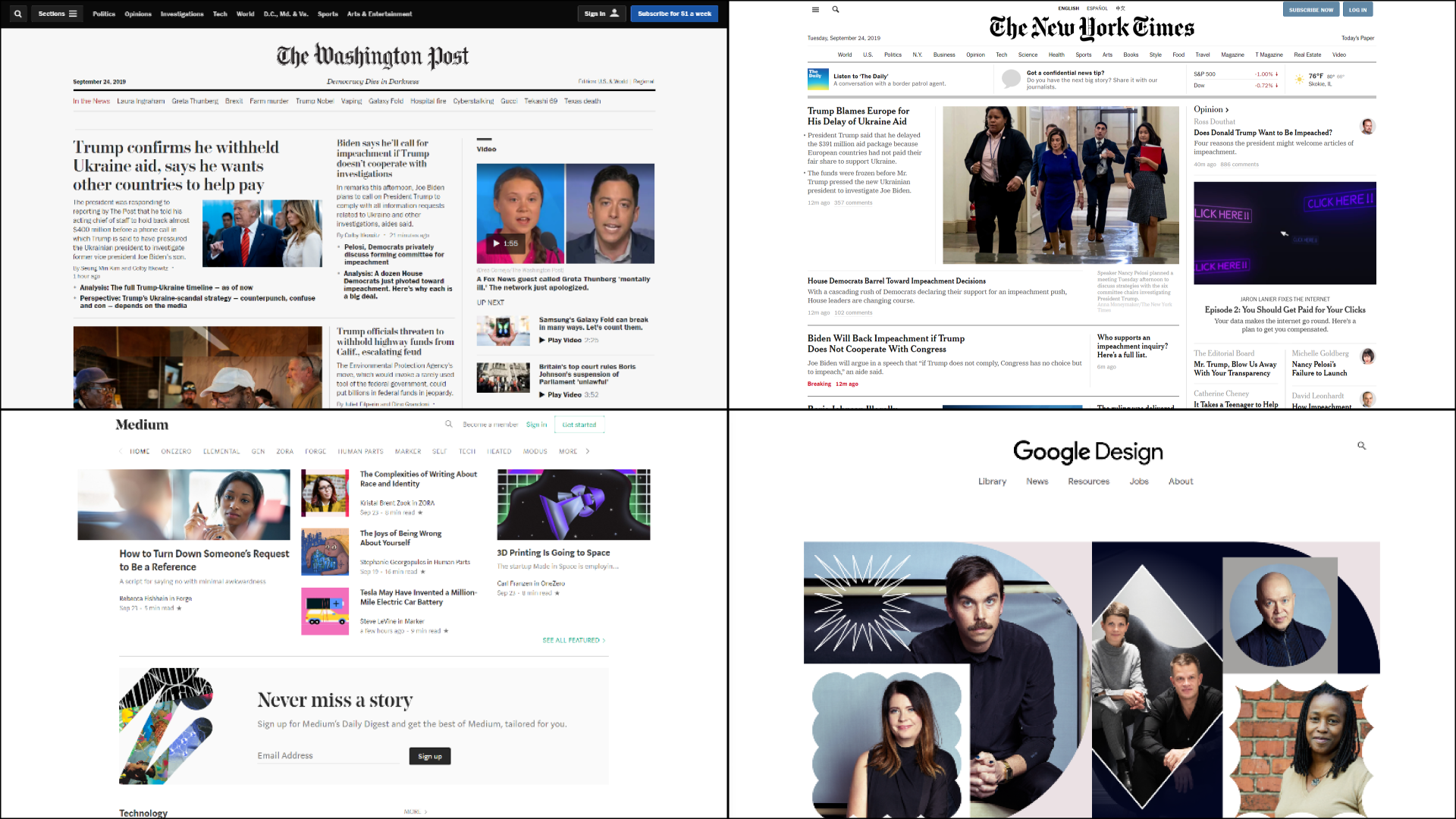
One more time, think about what you’re used to clicking. How much of how you interact with the following page is second nature to you at this point?
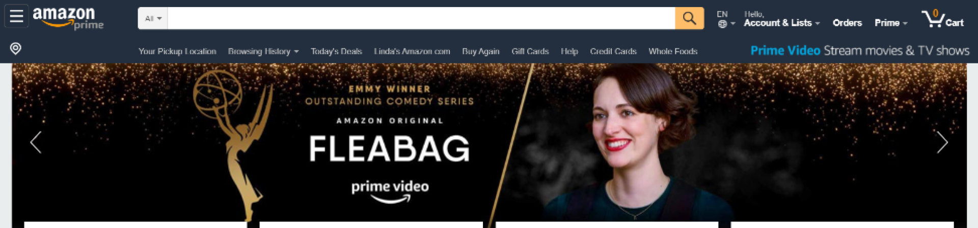
Image courtesy of: https://www.amazon.com/
What's unique often takes our expectations and riffs on them in a way that is delightful and not jarring:
- "Oh! What a pleasant hover state on this button."
- "I appreciate this font treatment for dates and subtitles."
- "Oh hey, that serif font actually works here. How refreshing."
Image courtesy of: https://momentfactory.com/home
This website utilizes what we’ve seen before. Logo in the top left, with links in the top right. There’s a large hero image with a title and call-to-action. However, this image is actually a video that extends beyond the normal borders and behind the header, making this website much more engaging experience. To some, this might be too much action and movement when arriving on this page. To others, they may feel that the visual interaction of the video and elements on the page creates a fun and delightful dynamic.
What we do is dance between the two of these. Trying to design with elements and styles that people are comfortable with, but also finding the space to create something that's more nuanced and more, you.
So today what I'm asking us to do, is to try to push the envelope a little bit when it comes to the website. Yes, I know most websites don't actually need too many bells and whistles, or they need a lot less, but ask yourself the following:
- Am I being too safe with my fonts? Are they really reflective of my organization.
- Are my pictures being used effectively? Filler/background noise is okay, but when I don’t need that, am I using photography deliberately and not “just because?”
- How are my micro-interactions? When my users hover over buttons, links, and other interactive elements, are those interactions jarring or delightful?
- Are we going too far with these? Will it seem like we're trying too hard to "fit in" with modern web design?
Addendum: Here are some of my personal favorite resources when it comes to brainstorming and inspiration.
Vanguard Tips & Tricks
We provide helpful hints you never knew you needed for our clients. Check out "Vanguard Tips & Tricks" to learn quick and simple hacks to make managing your website easier than ever.
A Call to Explore Styling
Consider the following websites. There are two newspapers and two blogs. What did you expect to see? Are there any elements that are used in a way that is different than what you expected? Were these effective and pleasing? Or jarring and uncomfortable?
Images courtesy of:https://www.nytimes.com/,
https://www.washingtonpost.com/,https://medium.com/, https://design.google/
What works is often what we've grown used to:
- Clicking on the logo in the header brings us back to the homepage.
- Navigation links are also in the header, with utility navigation links above the header.
- Maybe we're expecting some sort of hero image once we land on the homepage of a website.
- Wait.
- Is that a serif font? What the heck is THAT doing here?
One more time, think about what you’re used to clicking. How much of how you interact with the following page is second nature to you at this point?
Image courtesy of: https://www.amazon.com/
What's unique often takes our expectations and riffs on them in a way that is delightful and not jarring:
- "Oh! What a pleasant hover state on this button."
- "I appreciate this font treatment for dates and subtitles."
- "Oh hey, that serif font actually works here. How refreshing."
Image courtesy of: https://momentfactory.com/home
This website utilizes what we’ve seen before. Logo in the top left, with links in the top right. There’s a large hero image with a title and call-to-action. However, this image is actually a video that extends beyond the normal borders and behind the header, making this website much more engaging experience. To some, this might be too much action and movement when arriving on this page. To others, they may feel that the visual interaction of the video and elements on the page creates a fun and delightful dynamic.
What we do is dance between the two of these. Trying to design with elements and styles that people are comfortable with, but also finding the space to create something that's more nuanced and more, you.
So today what I'm asking us to do, is to try to push the envelope a little bit when it comes to the website. Yes, I know most websites don't actually need too many bells and whistles, or they need a lot less, but ask yourself the following:
- Am I being too safe with my fonts? Are they really reflective of my organization.
- Are my pictures being used effectively? Filler/background noise is okay, but when I don’t need that, am I using photography deliberately and not “just because?”
- How are my micro-interactions? When my users hover over buttons, links, and other interactive elements, are those interactions jarring or delightful?
- Are we going too far with these? Will it seem like we're trying too hard to "fit in" with modern web design?
Addendum: Here are some of my personal favorite resources when it comes to brainstorming and inspiration.
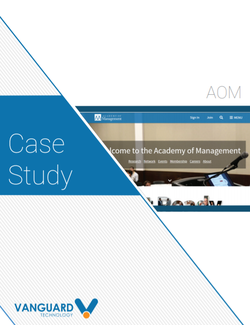
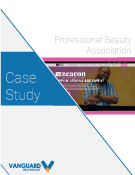
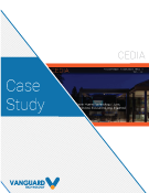
Case Studies
Vanguard conducts thorough preliminary investigative work to ensure your website is built to cater specifically to your target audience and meet your organization’s goals. Check out some of the case studies on some of our most recent client success stories.
What Can Vanguard Do For You?
As your organization grows and evolves, your website should as well. Whether you are looking to generate more traffic, implement custom functionality, mobile compatibility, integrate your systems, or give your site a complete redesign, Vanguard Technology is your go-to web partner. Reach out to us with your current concerns with your website, and our experts will happily provide a solution.
Leave a commentOrder by
Newest on top Oldest on top