
Make Video Embeds Responsive With Bootstrap
Making YouTube and Vimeo videos fit on a mobile device is easy with Bootstrap. A couple lines of code is all you need – here’s a step by step demonstration.
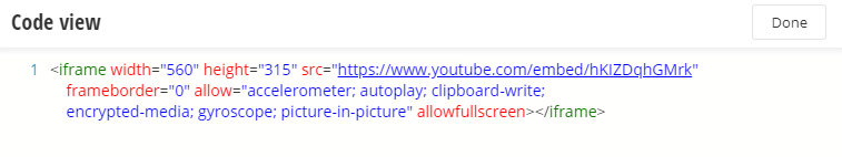
Here's a typical YouTube embed code, used for the video below
If you make this page narrower / wider you’ll see the video does not change size to fit.
Let’s fix that.
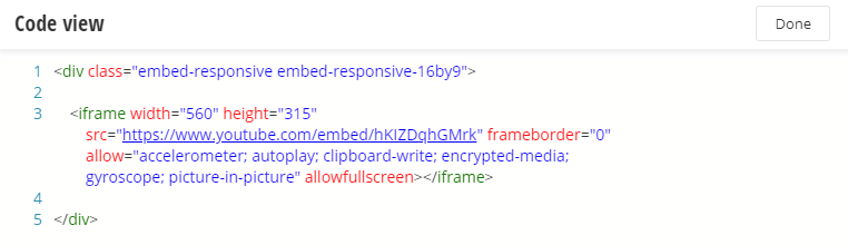
First, around the embed code, add a div with the classes "embed-responsive" and "embed-responsive-16by9". The "16by9" refers to the width/height ratio of the video: most have this ratio, but you can also use 4/3 or 1/1 - see the Bootstrap documentation.
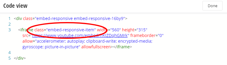
Then, add "embed-responsive-item" to the i-frame tag - and we're done.
The video below has the classes added. Resize your browser to see how it works.
That's all there is to it! If you have any additional questions, contact your Vanguard Client Manager.