
Utilizing Custom Grid Widgets for Ultimate Layout Flexibility
One of the greatest content features of the Sitefinity is the layout widget. It allows content editors to separate their content into columns and rows. Sitefinity uses content blocks, which are essentially where the content resides. A page can have multiple content blocks, and that’s where layout widgets come to play. For instance, you can place a 3-column layout widget and use three content blocks to get the content side by side. This is very beneficial for short text or imagery that should be grouped together. To go one step further, you can apply CSS classes to that layout widget to make content appear in a particular way - whether that be a background color, special heading styling, and more.
To begin, there are two types of layouts: Web Form and MVC. With Sitefinity’s switch from ASP.NET web forms to ASP.NET MVC architecture, there is a better way for developers and content editors alike to manage and control layout elements for your website.
Web Form Layouts
With the web forms version of Sitefinity, you have a list of percentage-based column layouts ranging from 1 column to 5 columns with varying widths for each column.
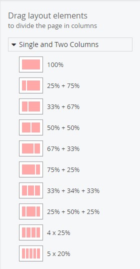
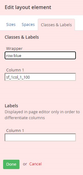
There is nothing too special about these layout elements and we can adjust the margin for each column, but we do not have much control over the presentation itself. If we wanted to add specific styles to these, the content editor would need to add a wrapper class to each layout block to make it look the way we want. For instance, if we wanted to create a new row that was blue, one would need to enter into that layouts’ settings and add in the class “row blue”:
MVC Layouts (Grid)
With the MVC version of the layout blocks, they are now referred to as grids. The reason for the name change is that it is now adhering to the Bootstrap grid system. Instead of having percentages as the indicator for the column widths, it is now displayed as numbers based on a 12-column system. So, in other words, “grid-6+6” is really “50% + 50%”.
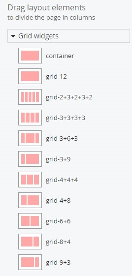
Another change is that there is no longer a margin field. The main reason for this is continuity between the column space. The spacing is already baked into the Bootstrap grid system, however, you can always apply the padding classes to each column if you want to change it.
Extending the Grid System
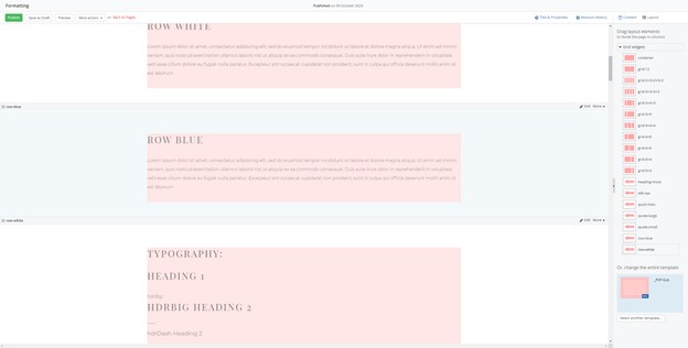
Sitefinity allows developers to create custom layouts within the grid system. For instance, we may want to make rows layouts to break the page up into sections. What we would do is create a custom layout that contains all of the special attributes that
is needed to make the content appear a specific way in and provide placeholders where the user will enter in the text.
The result would look something like this in the backend (see below). On the right-hand side, you can see we have custom
grids to fit certain layout needs.
These grids don’t just stop at rows. Anything that you would want to drag and drop in a layout grid can be achieved. It might be a placeholder for quoted text, or it may be used to hold columns of cards, making each card the same height regardless
of the content.
When it comes to custom layouts, imagination is the limit. To learn more about MVC grid system and how to customize it to work for your content, please reach out to a Vanguard Client Manager.