
The Do's and Don'ts of Side Navigation
Imagine, for a second, yourself visiting a website. You dove deep into the website, and are reading up on detailed, important content. After you get to the end of this content, you look up to go somewhere else. Maybe you look at the header of the webpage. Maybe you quickly scan the content and see some words underlined in blue. Or maybe, you see a small box to the right with links. When you click one of them, where do you go? Does it download a document? Show you were you are? Take you to another site?
Our trusty side navigation has been around forever. So today, let’s take a quick refresher and go over the do's and don'ts of side navigation.
Do: Indicate to your users where they are.
It's incredibly important to help your users orient themselves to where they are while navigating through your website. Whether this means bolding an item in the navigation or differentiating it from the links around it - you need to indicate to your users, "Hey! This is where you are."

Don't: Put directly downloadable documents into the side navigation.
The side navigation is for just that - navigation. Putting documents and, as we'll talk about next, external links into this section can throw the user off once they click on the respective item. When a user sees a link with a navigation section of the page, they expect it to take them to a page (as opposed to a link within the page that may say something like "download the document here"). If that user clicks on the link and it starts downloading a document instead of going to a page, the disconnect between the action that actually occurs and what was expected creates a negative experience.
Instead, lead the user to a page where they can download the document, even if it is a short page. This won't mess with the users’ preconceived understanding of how to travel through your site.
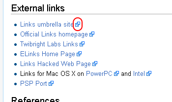
Don't: Put external links into the side navigation, but if you do…
…you must be communicative about it! Here is where we get to the crux of the issue when it comes to the implementation of side navigation. The side navigation is a tool to assist your users in traveling through the website. It is like a mini map outlining the section of the website they are browsing. If users can't understand what they're about to click on, or where it will take them, we have an issue.
So, if you have external links in your side navigation, add this simple icon letting your user know, "Hey you'll be leaving the website!"
In summary, consider the how the side navigation can say the following:
"Here is where you are, here is where you can go, and this is what you can expect once you get there."
If you have any questions about side navigation best practices, reach out to your friendly Vanguard client manager.