
A Call to Explore Styling
Posted: Sep 27, 2019
Design
Strategy
When you boil it down, websites are text, links, and images. And websites aren't going anywhere, at least for a long time. At times, because all websites boil down to these elements, websites can feel very bland or repetitive. However, we also know that these elements can be styled and arranged in ways that help them stand out, have their own character, and their own experience. And, as web designers, we're always in a tug of war between "what works?" and "what's unique?"
Consider the following websites. There are two newspapers and two blogs. What did you expect to see? Are there any elements that are used in a way that is different than what you expected? Were these effective and pleasing? Or jarring and uncomfortable?
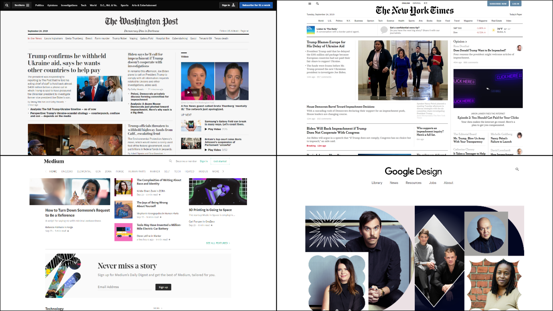
Images courtesy of:https://www.nytimes.com/,
https://www.washingtonpost.com/,https://medium.com/, https://design.google/
What works is often what we've grown used to:
One more time, think about what you’re used to clicking. How much of how you interact with the following page is second nature to you at this point?
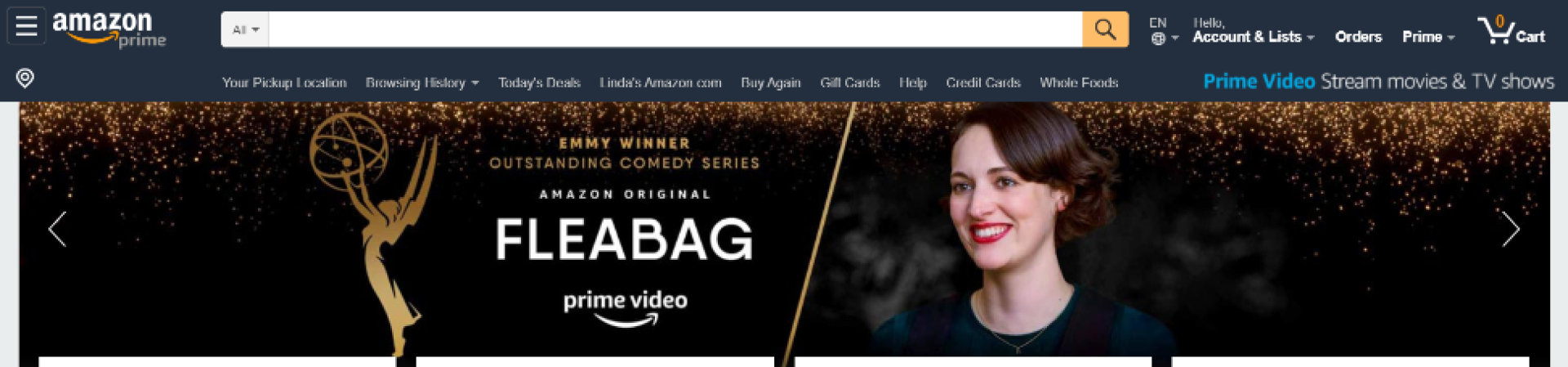
Image courtesy of: https://www.amazon.com/
What's unique often takes our expectations and riffs on them in a way that is delightful and not jarring:
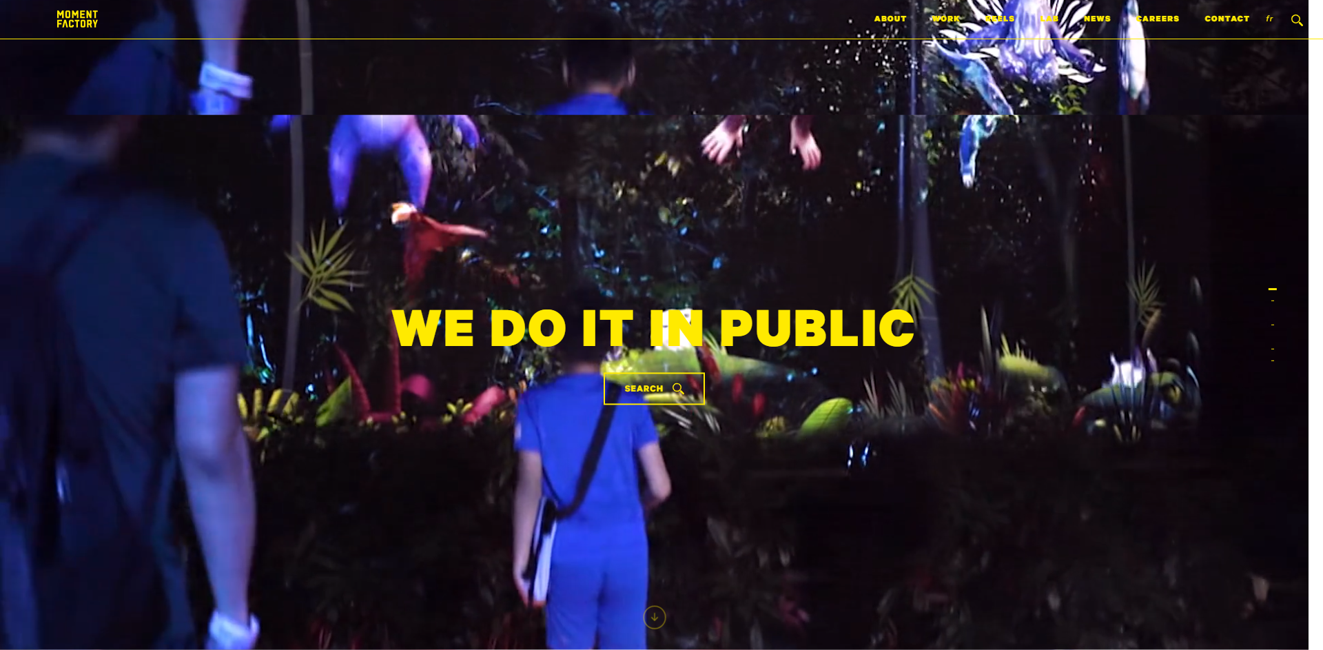
Image courtesy of: https://momentfactory.com/home
This website utilizes what we’ve seen before. Logo in the top left, with links in the top right. There’s a large hero image with a title and call-to-action. However, this image is actually a video that extends beyond the normal borders and behind the header, making this website much more engaging experience. To some, this might be too much action and movement when arriving on this page. To others, they may feel that the visual interaction of the video and elements on the page creates a fun and delightful dynamic.
What we do is dance between the two of these. Trying to design with elements and styles that people are comfortable with, but also finding the space to create something that's more nuanced and more, you.
So today what I'm asking us to do, is to try to push the envelope a little bit when it comes to the website. Yes, I know most websites don't actually need too many bells and whistles, or they need a lot less, but ask yourself the following:
Addendum: Here are some of my personal favorite resources when it comes to brainstorming and inspiration.
Consider the following websites. There are two newspapers and two blogs. What did you expect to see? Are there any elements that are used in a way that is different than what you expected? Were these effective and pleasing? Or jarring and uncomfortable?
Images courtesy of:https://www.nytimes.com/,
https://www.washingtonpost.com/,https://medium.com/, https://design.google/
What works is often what we've grown used to:
- Clicking on the logo in the header brings us back to the homepage.
- Navigation links are also in the header, with utility navigation links above the header.
- Maybe we're expecting some sort of hero image once we land on the homepage of a website.
- Wait.
- Is that a serif font? What the heck is THAT doing here?
One more time, think about what you’re used to clicking. How much of how you interact with the following page is second nature to you at this point?
Image courtesy of: https://www.amazon.com/
What's unique often takes our expectations and riffs on them in a way that is delightful and not jarring:
- "Oh! What a pleasant hover state on this button."
- "I appreciate this font treatment for dates and subtitles."
- "Oh hey, that serif font actually works here. How refreshing."
Image courtesy of: https://momentfactory.com/home
This website utilizes what we’ve seen before. Logo in the top left, with links in the top right. There’s a large hero image with a title and call-to-action. However, this image is actually a video that extends beyond the normal borders and behind the header, making this website much more engaging experience. To some, this might be too much action and movement when arriving on this page. To others, they may feel that the visual interaction of the video and elements on the page creates a fun and delightful dynamic.
What we do is dance between the two of these. Trying to design with elements and styles that people are comfortable with, but also finding the space to create something that's more nuanced and more, you.
So today what I'm asking us to do, is to try to push the envelope a little bit when it comes to the website. Yes, I know most websites don't actually need too many bells and whistles, or they need a lot less, but ask yourself the following:
- Am I being too safe with my fonts? Are they really reflective of my organization.
- Are my pictures being used effectively? Filler/background noise is okay, but when I don’t need that, am I using photography deliberately and not “just because?”
- How are my micro-interactions? When my users hover over buttons, links, and other interactive elements, are those interactions jarring or delightful?
- Are we going too far with these? Will it seem like we're trying too hard to "fit in" with modern web design?
Addendum: Here are some of my personal favorite resources when it comes to brainstorming and inspiration.